


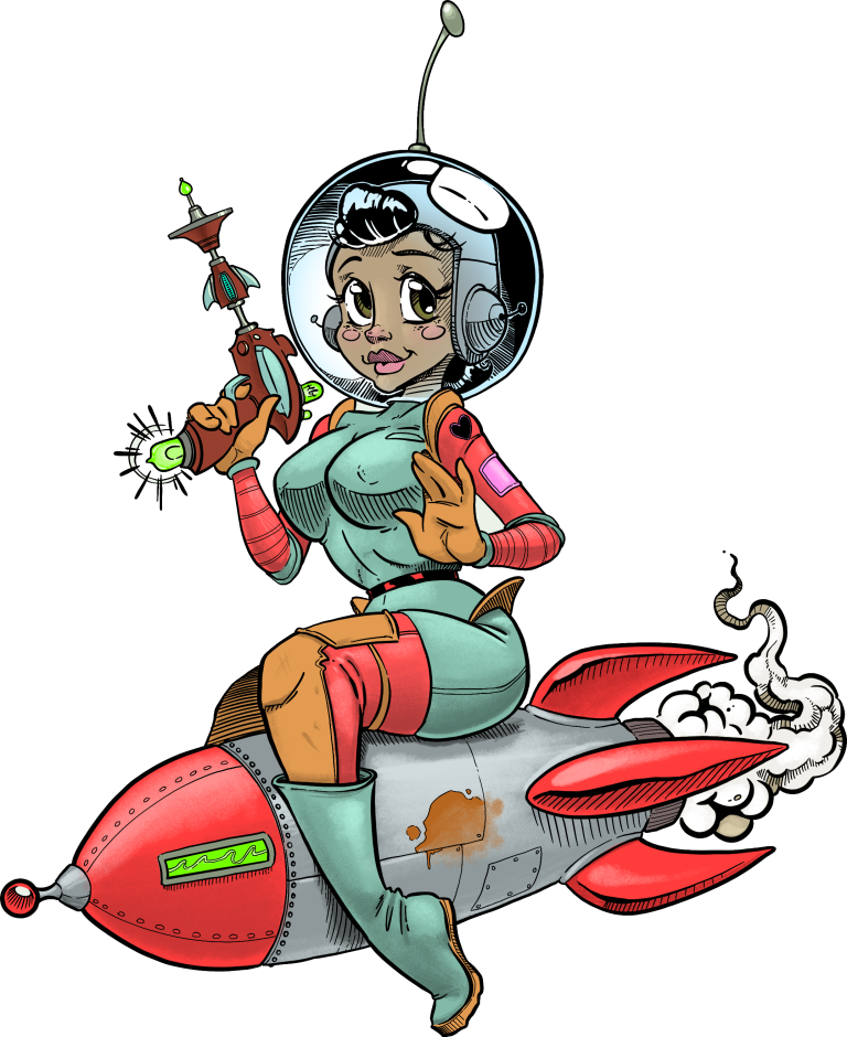
by Jason Campbell
[Disclaimer: In my day job I am a font designer, although I’m not directly connected to the people or works cited]
There’s been quite a lot of discussion recently in the TTRPG space about the use of AI artwork (art created by computer programs, most of which have been “trained” by analyzing human artists’ works) in publications. The argument against the use of such work is (mostly) that it puts artists out of work. The argument often made that the work is substandard could be more of an opinion regarding aesthetics. The underlying feeling here is that artists are a valued part of the creative community and they deserve to be paid for their work. But what kind of artists are we referring to?
I’ve noticed that the arguments about artists being fairly paid focus on illustration. Wizards of the Coast uses a specific style for their Dungeons & Dragons 5e books which includes a licensed copy of the font Modesto Condensed Bold, designed by type design artist Jim Parkinson with additional design from Delve Withrington in 2021. Many independent designers believe that imitating the style of Wizard of the Coast will make their publications look more professional so many independent publishers use copycat fonts such as the “Nodesto” font which you can find at many free font sites. Nodesto is a direct ripoff of Jim Parkinson’s work, no different than if an illustrator copied an image and gave it away as their own.
So I’d like to ask the independent publishing community: what’s the difference here between using illustrations where the artists won’t be paid, and using a font where the original artist hasn’t been paid?
Using a knock-off font to make a product look official or professional has the exact opposite effect and is a missed opportunity to make a creation unique and recognizable by kneecapping any chance it has of standing out from the crowd on its own merits.
As a type designer very familiar with Modesto and having seen how Nodesto is put together, I recommend against using Nodesto due to its very low-fidelity vectors. It is obviously the result of an attempt to make the vectors just different enough so as to (hopefully) avoid a lawsuit. For those thinking Nodesto looks exactly like Modesto — sorry, it is different (and really not in a good way). Another reason I advise against using Nodesto is because of it’s poor technical quality. Fonts are software and if a font isn’t engineered to standard specs, it may not work properly and may end up costing the user time and money — perhaps more than if they had just licensed Modesto from the beginning. How? Because if all the font info tables and bits aren’t set up properly, it could cause some applications to either ignore it, crash, or maybe it simply won’t print properly when the job is sent off to the printer, ruining those expensive professionally printed materials.
The Modesto typeface took hundreds of hours to create. Licensing a single font from the Modesto family still costs less than a good dinner out these days and will last much, much longer.