NOTE: the opinions expressed in interviews are those of the guests, not necessarily those of shadomain.com.
Today we talk with Delve Withrington, a noted type designer (yes, he makes fonts!) He worked on what many of you might know as the “Dungeons & Dragons 5e” font with type design hero Jim Parkinson. Let’s heear what he has to say!
You worked on the font(s) used by Wizards of the Coast in the fifth edition versions of Dungeons & Dragons. How did that project come about?
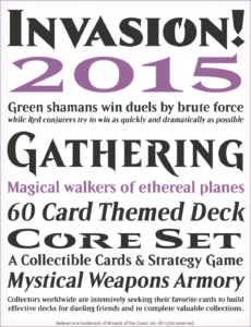
Beleren TM Wizards of the Coast
Thank you for the invitation to chat about crafting fonts for games!
Wizards of the Coast has been a client since 2011, starting with a commission to create a custom typeface for Kaijudo (anyone remember that one?). I also created the typeface Belerin for Magic: The Gathering. Fast forward to 2020 for the 5th edition of D&D, the folks at WOTC needed to update and expand the D&D typeface. I really enjoy working with them, so of course I said yes.
How long have you been designing fonts and how did you get started?
I’ve been drawing type in earnest since the mid-late ’90s. In hindsight, it’s obvious that I was always heading in this direction but becoming a type designer wasn’t planned. In fact, I didn’t know that was even a thing until a couple years after attending SCAD. While working at an architectural signage company, it fell on me to learn (the then brand new) Fontographer 3 to create fonts specifically for use on a CNC router. That was the “A-HA!” moment. It became crystal clear to me that type design is what I needed to do. It was a perfect trifecta of computers, art, and history. At that time, there were no type design programs at educational institutions available to me so I set about learning the craft on my own after work by reading every book I could find on the subject of typography and type design, while drawing lots of glyphs to put that new knowledge into practice. In 1996, I created a “type foundry” site on that new thing called the internet to display my fonts and maybe sell some too. I landed a job at FontShop SF in 2001 and learned a lot about the business side of type there. A few years later, I took a position as a (full-time!) type designer at Agfa-Monotype and working in an intensive production environment like that prepared me well for striking out on my own, eventually making this business out of it.
The original typeface, Modesto, used for titles in Dungeons & Dragons was originally designed by Jim Parkinson. Can you tell us a bit about Jim, the typeface, and the work you did to modify the typeface?

My friendship with Jim Parkinson goes back well over two decades now and in that time we have often discussed his life and work, the type industry, and of course drawing typefaces. We seek each other’s advice — me asking for his opinions on my designs and him looking for tips and tricks on using the font authoring software. Jim is quite a character and we’ve had many meals and good laughs together.
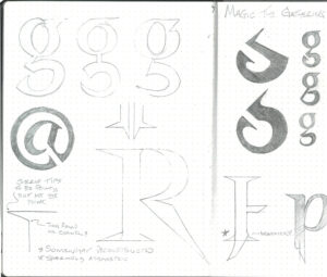
Initially, Modesto was specially modified by Jim himself for D&D. Later on, after Jim had stopped working, I had the pleasure of carrying the design forward to meet Wizards’ new requirements for the typeface. The project included some refinements to the design; most of the changes are very subtle (details matter) but it may be a little easier to see the differences of the lowercase letters e, g, and s by comparing the terminals of the before and after versions in the text styles. While working on the design, if I encountered a design problem, knowing Jim and his design sensibilities as I do, I simply asked myself: “What would Jim do?” and the solution would be there.
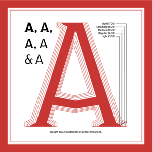
Still, the biggest part of the project was to apply technological improvements in order to allow the talented designers at Wizards to work more efficiently with the typeface. For example, where there were multiple font files with different styles, a variable version was built that incorporated them into a single font file. The variable font also gives designers the capability to fine-tune aspects of the typeface to better fit any design or layout for D&D they might tackle. Perhaps all this behind-the-scenes font stuff is not so exciting to non-designers but the typography for D&D will definitely benefit from the improvements for years to come.
You’ve been an accomplished font designer for some time. Did you have any knowledge of Dungeons & Dragons, role playing games, or fantasy video games before working on this?
I played D&D with my friends as a teen and Magic with my son when he was younger so I’ve always been at least familiar with RPGs. I am definitely more drawn to video games though, with Fantasy and Sci-Fi being my go-to’s (and always have been).
Many of our readers self publish their own role playing game products, and are likely used to commissioning artists and layout artists. Can you explain the value you see in choosing a high quality typeface for use in publishing?
Sure thing. From my perspective as a type designer, broadly what constitutes a high quality typeface is: originality, accuracy, dependability, and extensibility. Of course, that’s not all there is when it comes to choosing a typeface. There’s also cost and time.
Licensing type from a designer or foundry instead of downloading a free font from a questionable source comes with support and some guarantee of technical quality and performance. There are many independent type designers and type foundries of all sizes these days. Quality may vary a bit, but I don’t think I’m speaking only for myself when I say that overall, type designers are very diligent about their craft, striving to make great, original work, and are willing to resolve any technical issues that may occasionally arise.
Getting back to the expense and time thing now: If you are on a small budget and need something quickly, look for retail typefaces that have large families with ample weights (think from Thin all the way to Black), several styles (e.g. italics, small caps, caption, display versions, etc.), additional widths like Condensed or Expanded, and broad language support. The reasoning here is to choose a typeface that can accommodate all your immediate requirements but also allows for the growth of your game and its brand. So if you only need one weight and style at the beginning, you can license only that. Then later on, when you need additional weights or styles, you’re not stuck — just license the additional ones you need. Do note however, licensing an entire family up front rather than a bunch of individual styles separately over time will save money.
Taking it to the next level, there is custom or “bespoke” type. Like commissioning work from an illustrator, you may commission the creation of a new typeface from a type designer but this involves development time, which varies depending on the amount of work involved. The value in taking this route is primarily the guarantee of uniqueness and the option of exclusivity: the typeface will be specially tailored for your game and will meet all your requirements; and if exclusive, it will only be used by you. There are different options for exclusivity: Exclusive (the priciest) is essentially a buy-out (of the rights) but it means the typeface is 100% yours and no one else can ever use it without your permission. Then there is Limited Exclusivity, which is usually for a certain period of time, with the cost and period of exclusivity being negotiated. Lastly, there is the (relatively less expensive) Non-Exclusive, which means the type designer/foundry will retain the right to license the typeface to others. The good thing is you still get exactly the typeface you want but the downside is there’s a risk someone else might use it for their game too.
Do you have suggestions for typefaces that you’d recommend for use in fantasy publications? How about for the sci-fi genre?
That’s a tough question because there are so many great ones out there. Among the classics are Eurostile and Futura for Sci-Fi or Albertus and American Uncial for Fantasy. Those have been used so often for these genres, they instantly signal what a viewer may expect. What I think is more interesting though is to do something unexpected and there is fabulous new work by contemporary type designers all the time as well, for example: Swell Type and Letterhead Fonts.
Can you tell us about some recent projects, and some things we can look forward to from your studio?
I’m really excited about several new typefaces that Delve Fonts will drop soon — perhaps some of them will fit into a sci-fi or fantasy game. 😉 It’s part of a larger effort I’ve been focused on over this past year to further develop the foundry itself by bringing more voices to the mix, which includes new articles on the blog (by people other than me), and more typefaces to the catalog by several designers new to the foundry.
Where can people find your work?
The Delve Fonts website, of course: https://delvefonts.com
Instagram: https://www.instagram.com/delvefonts/
Mastodon: https://typo.social/@delvefonts
And these fine distributors of type:
Adobe Fonts: https://fonts.adobe.com/foundries/delve-fonts
FontBros: https://www.fontbros.com/foundry/delve-fonts
Fontspring: https://www.fontspring.com/foundry/delve-fontsI Love Typography: https://fonts.ilovetypography.com/fonts/delve-fonts
Thanks, Delve!
If you’d like to be interviewed at Shadomain, fill out this simple form and we’ll publish your answers on an upcoming Wednesday: https://shadomain.com/interview/
If you’d like customized questions about what you do, just email info@shadomain.com