

By Jason Campbell
Today we’re talking about designing books for RPG creators who self-publish. In the way of full disclosure, I studied visual design and have been working in the field, mostly in typographic design, for more than 30 years. However what follows are only opinions and often used guidelines, but there are exceptions to every guideline.
Choosing Fonts
There’s a lot, am I right? Don’t worry, you’ll find the ones that work for your project, and there’s no strict rules so you won’t be wrong. There are some tried and true guidelines, though. The western printing press was invented nearly 600 years ago, and movable type was used in China nearly 1000 years ago, so there’s a lot of history here of page design. We can stand on the shoulders of giants and make use of what they learned.
Please note that this article will discuss issues in designing for western languages, including Vietnamese and many African languages. Designing for Chinese, Japanese, Korean, Arabic and many other languages have different concerns and deserve their own article.
Serif and Sans-Serif Fonts
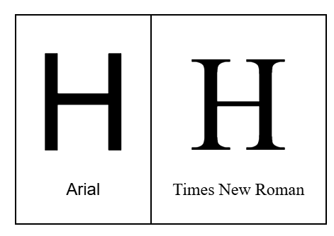
Two major categories of typefaces are Serif and Sans-Serif – you’ve probably heard these terms before. Serifs are the small features at the end of the strokes of letters in typefaces such as Times New Roman, Bodoni and Cambria. The origin of serifs goes back to calligraphy of
Ancient Rome and has been in common use since the invention of the printing press.
Sans-Serif typefaces are much newer, becoming popular in the early 1900s based on modifications to fonts used in wood type printing. Arial, Helvetica and Futura are Sans-Serif typefaces.
So Why Serifs? When Serifs?
When should you use sans and when should you use serifs? The answer comes down to headlines and body copy. Not every piece of text will be one or the other, but generally speaking the words at the beginning of sections of text that summarize the topic and are usually set larger are headlines, while the main text explaining your topic is body copy. It’s important that your body copy is legible and readable. It should be comfortable to read, which helps readers understand the subject matter. Headlines have a different goal. They certainly need to be legible, but they attract the attention as a reader skims through the material.
It’s generally acknowledged that well drawn serif typefaces are easier to read. It may seem illogical, since serifs are additional details, but studies show [Edit: In my opinion] most people read faster and more efficiently when reading text set in serif typefaces. Please note that there have been many studies over the years on how people understand text with few universal conclusions* , but generally large amounts of body text is easier to read in serif typefaces. Your body text will also be easier to read if you choose a regular or medium weight typeface, avoiding extra-bold and light versions as well as condensed versions.
Headlines are a different story. Here you can get more creative. Historically, newspapers used serif typefaces for headlines, but they would choose bold or black weights. It’s also common to use a bold sans typeface in a headline, with a serif typeface for body text.
Use a Cool Font – Sometimes
One problematic trend I see is that someone finds a cool font that works very well at conveying the theme of a game, and that font is then used everywhere. I’ve seen this in a lot of streamed games where a really cool looking font is used for all text in the screen overlay. We can use the ideas we discussed above in this case. That cool font looks great showing the title of the game, but it might not work as well to show each players’ name and pronoun because that font is intended for headlines, body text. You don’t need to feel limited to a single font for your overlay. You can use a cool font for the larger text like the game name, but the smaller text – the players’ names, etc. – that should be readable should be set in a typeface designed for body text.
Conclusion
It’s important that I emphasize that these are guidelines. There’s no absolute laws in design, but there are acknowledged common ways of working. What do you think? Do you have a favorite typeface? Let us know below, and let us know if you’d like us to cover any other topics about designing your books.
- – Noting that this article is lacking citations for these studies. See comments for additional discussion.


I just have to mention the irony that the article recommends using a serif font in the body, while the article itself is displayed with a sans-serif body font.
Surely this is because readability works differently when reading from a screen rather than reading print. Print (on paper) is generally much crisper (think higher resolution) than a screen. The little details like serifs can get lost in the pixels on a screen, so simpler, sans-serif lettering is often preferred for on-screen text. This is true even on a higher-resolution screen like is usually found on a smartphone—even 144ppi doesn’t produce the same clarity as a good paper printing process.
Great points!
I have to admit the reason the article is set in Sans is because WordPress defaults.
While this article is focused on layout for print, all of your points about print v. screen are critically important. What makes this so much more difficult now compared to 20 years ago is the many different screens the reader could be using, and the differences in rendering across operating systems and devices.
Thanks for the comment!
Great thoughts!
I have been told that sans serif make for easier reading on a digital screen. Is there anything to that or is it just an internet myth?
Hey, thanks for the comment and question. Honestly this is a question with a complex and long answer. It deserves its own post, but that might be better suited to my typographic site, campbellgraphics.com.
The advice you’re asking about is common and has a lot of support, but there are a few things to keep in mind:
1. “Digital screens” means something different now than it used to. 20 years ago designing for screens meant designing for reading web pages on a computer monitor, while today it also includes mobile devices and tablets. In fact if you’re designing a web site, it’s likely that a new viewer has about an 80% chance of viewing it on a mobile device. Designing for different devices involves considering screen resolution and text rendering systems.
2. Your audience is changing. If you’re 40 years old or over you grew up mostly reading serif body text in books and newspapers. But if you’re 30 years old or younger, most of your reading was on digital screens, which (because of the idea you mentioned) meant you read a lot of body text set in sans typefaces. Our own reading history has a lot to do with our reading comfort, and possibly speed.
It’s also true that not every study in this area was created eqaul, and unfortunately there are many studies in this area that claim things that good research doesn’t necessarily support.
So yes, Sans is more common in places such as the web, but often for historical reasons that aren’t as important as they used to be, as rendering technology changes and (mostly) improves. If you’re concerned with reading comfort, often things such as a typeface’s “x height” has more of an impact than whether it uses serifs or not.
I’ve looked up research papers from a few science and psychology journals for projects in the past, and so far the conclusion from the vast majority of the modern published studies I could find is actually that there is very minimal difference readability, and serif is only an aid in certain types of neurodivergence, but can actually be a detriment for other types of neurodivergent types. Sort of canceling it out with Serif just being more common in print, so that’s what people are used to. Where-as with younger generations, due to more exposure to digital, they actually find Sans-Serif easier to read.
Since you stated “studies show”, can you give me a reference as to which studies you used for your references?
Thanks for your comments, these are great points. I shouldn’t have mentioned studies without a proper citation. I’ve edited those references in the text to change “studies show” to “in my opinion”. I’ve read various research, but I don’t have specific studies in mind, so I shouldn’t claim any research supports my own opinions.
For explanation, I’ve discussed similar issues with Kevin Larson of Microsoft
and learned from research spoken about at RIT Reading Digital Symposium
But I don’t want to claim either as support, since
a. neither show evidence specifically about the statements I made
b. these go back more than 10 years, and more recent research may support contradictory statements.
Thanks for keeping us on track!
– Jason Campbell